Monday, September 19, 2016

A Brighter Happier Kitchen

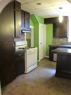
In case you forgot, here's what we started with:

  • Heavy, dark tile over the top of laminate, complete with rotting grout
  • Pendant lights hanging between non-functioning fluorescent lights in a drop ceiling that belongs in an office or public school
  • Fridge blocking a cupboard and eating a lot of floor space
  • Non-matching appliances
  • Minty-green painted wood paneling
  • Oh, and stone tile backsplash
  • Also, those cabinets were originally blonde. They are coated in a gel paint that is a mix of brown and black. Up close it's ugly and streaky.

 Fridge invading the room. And don't forget there is a cabinet to the left of it which is blocked but visible.


Below, see how close the counter is to the closet door? Yeah, that door barely opens.

The photos make it look much nicer than it is. We probably could have functioned with this kitchen. Except the rotting grout...that's pretty gross for a food prep surface, but I suppose there are always cutting boards.

Regardless. I decided this room was priority number one for repairs. My plan was to:
  • Remove a couple cabinets so that the closet door opens, and so that I could fit the fridge in front of the other closet door to the foyer.
  • Paint the cabinets white
  • Tear out the counter tops and replace them with butcher block
  • Tear out the back splash and do a green subway tile
  • Pain the wood paneling another color
  • Buy new lighting
  • Replace the ceiling tiles with new tiles that look like old timey tin or copper ceiling
  • Move the white stove down from upstairs and move this off-white one up there.
We did oh so much more than that, but not by choice.

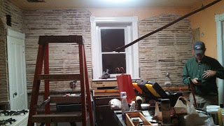
My mom wanted to help by removing all the wood paneling. She'd fixed plaster before.


But as you can tell, our plaster crumbled to dust when the supporting wood paneling was taken away. Our house is about 30 years older than hers and in a more humid state.


Hey look, this wall held up okay. It's just covered in glue we have to scrape and sand.

So we added a major dry walling project to our plans.


Oh and we got my new counter installed!

Then my parents left and Chris and I were on our own again, without a finished kitchen. We delayed our move in by a month.

During that time, we cut a hole for the sink and installed it.

And we mudded and sanded the drywall some more.

And then my parents came back a couple weeks later to finish the job. 

Mom painted the ceiling. And Dad installed a simple oval LED light fixture.

Because the bottom half of the walls were weird, we opted to simplify our efforts and cover them with bead board.

Mom painted the walls while I painted the cabinets.

We couldn't get the off-white stove upstairs, so we left the white one up there, and I bought a stainless steel to match the rest of the kitchen. And a microwave to replace the disgusting hood that was there. Not my most cost-conscious choice, but man this room is so much better.

And thanks to Dad for doing the electrical.

We ended up demolishing the entire island, so we rigged this with the spare counter top and some cheap book shelves. Not the greatest, but hey, we can access that cabinet now!

 Also, my dad is a goofball.

Since then, I've done some touch-up painting (I'm not done yet), I did a portion of the tiling (I'm not done with that either), and we bought a real kitchen island.

See my tiling to the right? I still need to tile behind the oven.


I need to hang a picture or put some shelving in that open space. Can you believe the giant fridge used to be where that tiny shelf is?


So far, this was our biggest project and our biggest triumph. This kitchen is so spacious and easy to work in. And man I love that island for pastry making. 

Saturday, September 17, 2016

Home Tour (before we made changes)

Here's a tour of our monster house puzzle. I do officially call our house the monster house. 

The front half was built in 1988. The back half was added in 1951. I suspect the porch was added at the same time as the back add-on. 

Below are mostly photos that were available online when we were house hunting. This is what we saw that somehow enticed Chris to want this house. I still don't understand his brain.

The front


The top of the stairs off the foyer. Nice wallpaper huh?


Bathroom off the top of the stairs.

 Kitchen, opposite the bathroom.


One of the upstairs bedrooms


Not shown is the other upstairs bedroom. It has the same carpet and dark blue walls.

If you go back down stairs to the foyer, there is a door to a closet that leads to the kitchen and a door to the living room. The living room is one of the nicest rooms in the house. I don't understand why it wasn't included in the online photos.

Dining room

The room beyond the doorway is the living room. To the right is the kitchen.

You know what's super cool about our dining room? Those french doors lead to a bedroom with super dirty shag carpet and wood paneling painted robin's egg blue. (Yeah, so I lied. Not cool.)

Master bedroom viewed from the dining room. To the left is the mudroom.

Back up into the dining room and turn the other way, and you find the kitchen. The photos don't do justice to its weirdness. See the little door? It leads to a coat closet, with the foyer beyond. The other is a closet under the stairs.

That nice looking granite tile counter has been laid over the top of existing laminate, and the grout is rotting, especially by the sink. In person, it's gross. It's also really heavy, and the floor in the kitchen had done some serious sinking.

The fridge is blocking a cupboard built into a window where the house used to end. It's a monster fridge awkwardly jutting into the room. Isn't it great how the appliances match?

 And pendant lighting from a drop ceiling. Better yet there are 2 big fluorescent lights in the ceiling that don't work at all.

Whoever was selling the house really wanted to show off the thresholds between rooms. The kitchen tile is over top the old floor, so I trip here a lot.

Near to the kitchen is the main floor bath. Mmmm black tile that should have been resealed a while ago. My favorite. (Or not.)

Blue is not my color of choice, but I can't complain about this easy to clean shower surface. I can complain about the lack of vent and the bubbling and flaking drywall that needs repaired.

 This pedestal sink rocks and is sitting on top of a visible board because it is too short for where it's plumbed to (of course that detail isn't in the picture). Also, who doesn't love a stained glass look on their medicine cabinet? (Me that's who.)

Off the kitchen and the bathroom is the mudroom. These vinyl tiles are peeling up all over the place. To the left there's also a sink with pink tile just outside the bathroom. Beyond the shelf you can just see is the washer and dryer.

Upstairs off the mudroom is the sun room. Check out the plywood floor painted gray, the original lime stone, and the corrugated fiberglass skylights. 
This room is for cooking people alive when it's sunny. Oh, and just beyond the stairs, do you see that old sink used for plant caretaking? If anyone's counting, we've seen 5 sinks and discussed 1 not pictured. We're not done with sinks yet either.

To the basement! Yes, they did leave this plaid couch for us.

View from over by the couch. Entrance to basement is up and to the left. There's also a utility room that-a-way. It's FULL of junk.

I was kind of excited about the fireplace, until I learned it was converted to gas and vented through a crumbling fireplace.

Hey our 7th and final sink! While I appreciate the basement sink, plumbing a full bathroom down here is pretty much impossible. Also, since they didn't dig egress window, you can't have a legal bedroom down here either.

Let's get out of this place. It's a joke.

Look out the back door, and you see the garage. It was actually repainted brown before we bought the place. I don't have a photo of it. This was discovered on the county website.
The garage is full of spiders. I hate spiders.

And ta da! The back side of the house, which looks nothing like the front.

We have gravel parking just at the end of this path. The garage sits to the right.

So that's our Monster House. Our great puzzle to solve.


Buying the House I Didn't Want

In fall 2015, we started looking at houses. Here's the checklist we gave our realtor:

  • Under $180,000 - really we wanted a lot cheaper
  • About 2-3 bedrooms - kids are a big if for us, so we just needed a guest room since my family visits from out of state
  • 2 bathrooms, 1 with a bathtub - I like to read in the tub 
  • Fixer upper - we wanted to feel like any change was an improvement, not superficial preference
  • Walkable to work in under 20 minutes
Chris had this bad habit of looking at houses outside our price range, which annoyed me. At one point, he showed me a house listed for $225,000 with a weird room:


What the heck is that room for? What is that thing to the right? We speculated that the house must have been some sort of B&B. 

We drove by the house to try to figure it out. This is the back side of the house. 


You'd never suspect, that this is the front side of the house.


It's like two completely different houses glued together.

Chris wanted to go see the house. I told him he was out of his mind, and I refused. 

It was huge! It has 2 kitchens, 2 bathrooms, 3 official bedrooms, a finished basement, a giant mudroom, a dining room, a living room, and of course the strange room (it's a sun room by the way).

A month or two later, the house dropped to $200,000. It had been on the market maybe 150 days with no bites. I agreed to go see it to get Chris to shut up about it.

Not only was it huge, but it was weird.

What the heck could we do with this long bedroom? By the way, this view is from the french doors that open from the dining room into this space. Weird.


I said no way. We didn't need that much space. And it was too strange. I had no idea how to solve the problems posed by this house.

Chris was excited. He was fascinated by this puzzle. He wanted this house. Chris doesn't get excited about anything, so I said okay and started brainstorming what we could do with it. The one bonus was that the house had been split (sort of) into 2 rental units, so we could rent out part.

Here's how we ended up:
  • We got the house within the budget we set (barely)
  • Despite being huge, it really only has 3 bedrooms, though one of the bedrooms is used as a living room for our tenants. So at present, it's a huge house with 2 bedrooms.
  • We got 2 bathrooms, but since we rent out part, the bathroom with the tub belongs to our tenant. It's a sad existence for me.
  • It's sure as heck a fixer upper. More than we bargained for.
  • It takes 30 minutes to walk to work. 
Yeah. We failed utterly in our goals. And I often have to bite my tongue so as not to say "I told you so." Despite being really careful with additional inspections, we had to replace the furnace, AC, and water heater right away. We knew going in that the gas lines and water supply lines all needed replace. All that, puts us over budget, by a lot. Becoming owners of this house was a stressful nightmare.

At this point, Chris wishes we'd bought something else, and I'm attached to this house because we've been pouring our hearts and souls into it. I'll try to catch everyone up on our projects soon. (We've been at it just shy of a year now.)